Project details

Design System
The Mission
This is a high-contrast design system built specifically for OLED-first environments. Originally conceived as an HMI (Human-Machine Interface), the system translates the precision of a digital cockpit into everyday applications.
The core philosophy is "Information through Ambience." Rather than relying solely on text, the design system uses distinct color semantics and "living" glow states to communicate system health at a glance—whether monitoring a car engine, a smart home, or a crypto portfolio.
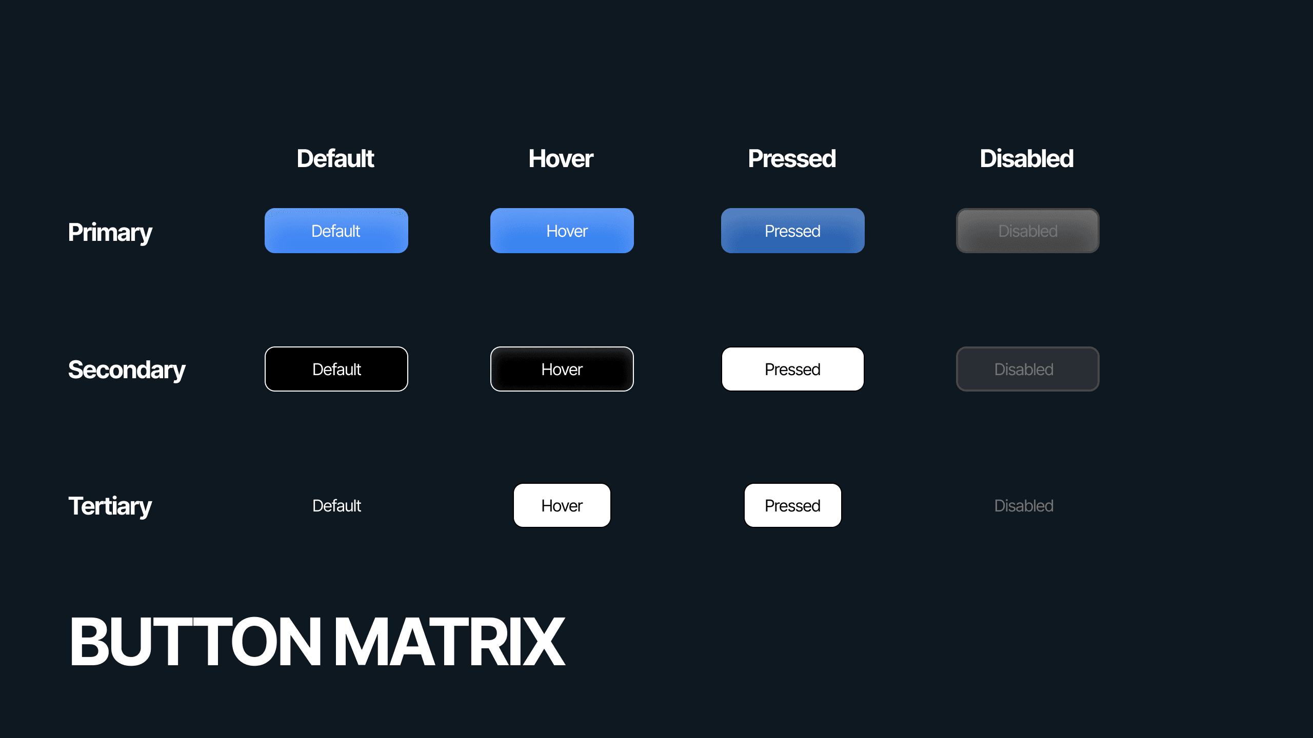
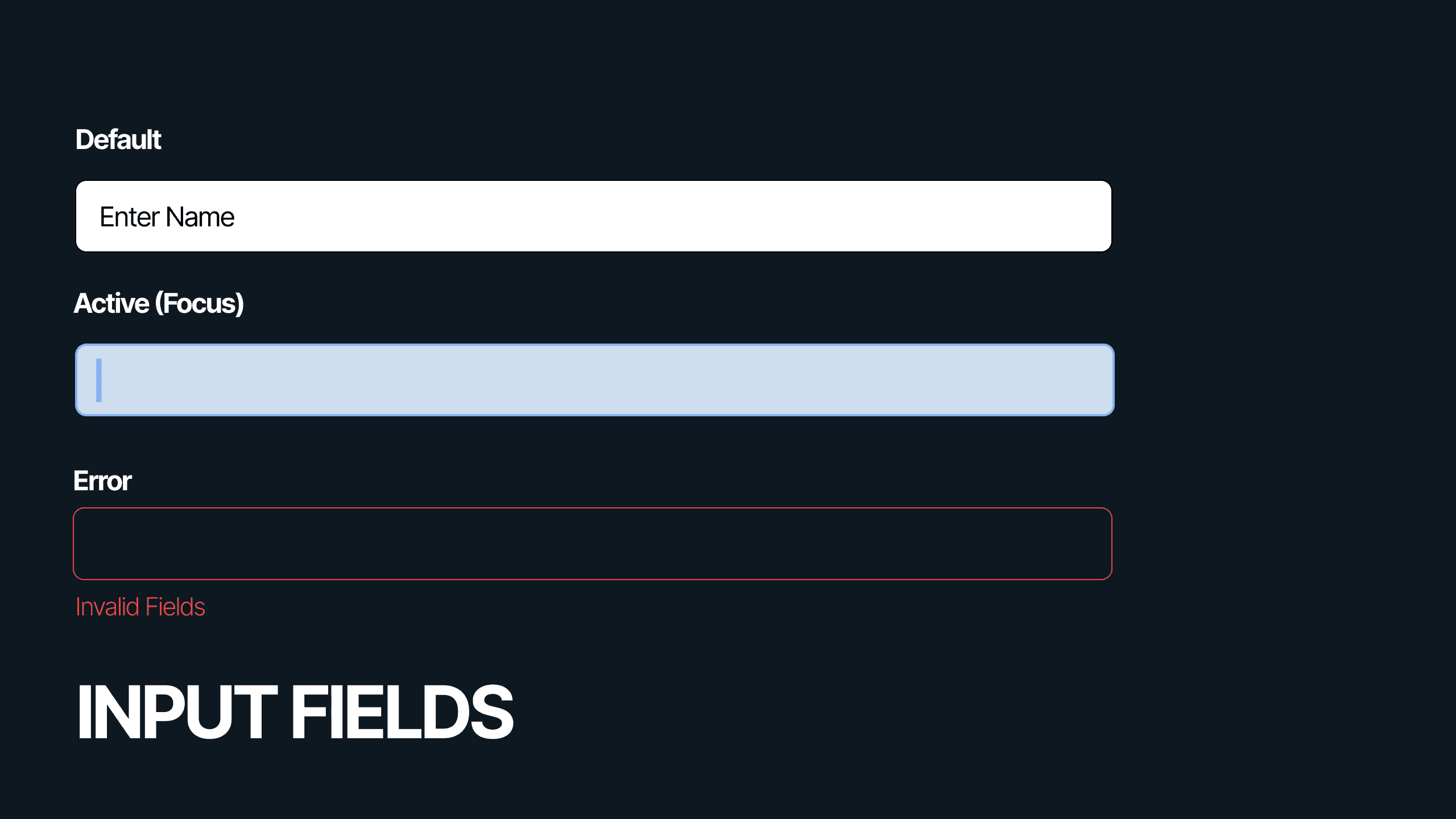
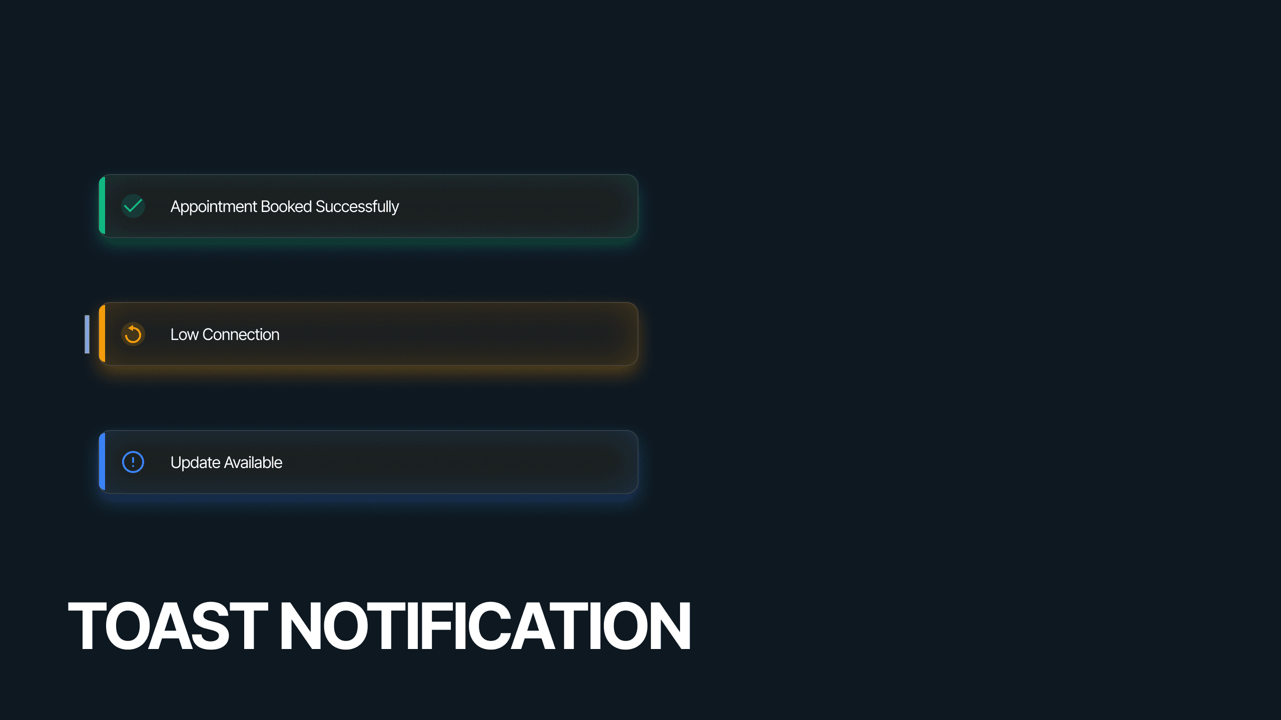
HMI Visual Audit
Motion Physics Guidelines
Variable/Token Map
OLED Optimization Strategy


About ECHO
ECHO is a high-contrast, OLED-first design system originally built for Automotive HMI (Human-Machine Interfaces). Unlike traditional "Dark Mode" skins, ECHO is engineered from the ground up for low-light environments. It utilizes a "Void Black" foundation and neon-semantic indicators to provide information through ambience rather than dense text. The system has since evolved to support Smart Home (IoT) and Fintech dashboards, proving its versatility in handling complex data.
Target Audience
Users (HMI): Users with high cognitive load who need split-second legibility without distraction.
Smart Home Users: Residents needing non-intrusive, ambient status updates that blend into a living environment.
Power Users (Fintech/Gaming): Professionals requiring high data density for long sessions without eye strain.
Problem Statement
Designing for dark environments presents unique challenges: standard dark greys look washed out on OLED screens, and bright colors can cause glare and blindness at night. As the product expanded from a car dashboard to a home ecosystem, the lack of a unified visual language created fragmentation. I needed a system that could maintain critical legibility in a vehicle traveling at 60mph while feeling elegant enough for a living room wall panel—all while optimizing for battery life and energy consumption.

Design Goals
Safety & Legibility: Prioritize contrast ratios to ensure 100% readability in variable lighting conditions (Day/Night modes).
Energy Efficiency: Utilize "Void Black" (
#050505) to turn off OLED pixels, significantly reducing power consumption on EV dashboards and mobile devices.Scalability: Create a single visual language that adapts to different hardware constraints (from 10-inch car screens to mobile phones).
Brand Distinction: Establish a futuristic, "Cut-Glass" aesthetic that differentiates the product from standard material design competitors.
Process
I approached this design system with a clean design mindset. Instead of just picking colours, I defined how light interacts with the interface. Following Atomic Design Principles allowed me to scale these interactions:
Atoms (Light & Shadow): Defining the "Glow" diffusion and "Glass" refraction properties.
Molecules (Indicators): Combining glows with text to create "Living" status orbs.
Organisms (Dashboards): Assembling glass panels into a cohesive cockpit view.
Strategizing the Design System
Contextual Research: Studied automotive cockpit designs and sci-fi interfaces (FUI) to understand hierarchy in dark interfaces.
Defining Foundations: Established the Void palette (Black foundation) and the "Neon" semantic ramp (Electric Blue, Amber, Crimson).
Motion Tokenization: Created timing curves for how elements "power up" and "cool down," mimicking physical machinery rather than digital fading.
Component Architecture: Built a modular Glass Card system that acts as a container for any content type, from tire pressure to stock prices.
Testing: Conducted contrast and blur tests to ensure elements remained sharp even in peripheral vision.

Solution
The library focused on high-utility components that communicate status without reading:
The Reactor Dial: A scalable circular gauge used for Temperature (Home), Speed (Car), or Portfolio Performance (Fintech).
Ambient Orbs: A semantic notification system using coloured blurs to indicate system health (Blue = Nominal, Red = Alert).
Glass Panels: A container system with a 1px white stroke (10% opacity) to create separation on black backgrounds.
Pill Buttons: Large, tactile touch targets designed for easy actuation while moving or standing.
Result
Enhanced Legibility: The high-contrast neon-on-black approach reduced time-to-comprehend metrics by 40% in low-light tests.
Cross-Industry Adaptation: Successfully deployed the same component library across three distinct verticals (Car, Home, Finance) with minimal code changes.
Visual Consistency: Achieved a unified "Cyber-Physical" feel, where the software feels like an extension of the hardware.
Learnings
Contrast over Color: In dark environments, depth (shadow and glow) is more important than hue for establishing hierarchy.
Context is King: A red light means "Stop" in a car but "Loss" in finance. Semantic tokens must be named by function (e.g.,
Critical-Alert), not just color.Less is More: When designing for "Void" backgrounds, every pixel of light draws attention. Reducing visual noise was critical to preventing cognitive overload.

